.png)
How to Design High-Converting Landing Pages in Wix Studio
- Volt Agency

- Aug 13, 2025
- 6 min read
Updated: Aug 19, 2025
A landing page is what makes or breaks the outcome of any campaign. Every element, from layout to wording, has to work toward one specific goal: getting people to take action.
Wix Studio provides the perfect balance of freedom and control, enabling you to build targeted landing pages with performance in mind. In this guide, we’ll walk through how to design one from scratch—starting with the strategy and moving through to layout, calls to action, and final optimisations.
1. Start with the Strategy, Not the Software
Before opening the Wix Studio editor, you need to get clear on the message you want to send and what you want to achieve. When you don’t know exactly who you’re targeting or what action you want your visitors to take, no amount of design polish will deliver results.
A few questions to ask yourself:
What’s the goal of this landing page? (Are you aiming for sign-ups, purchases, downloads, or event registrations?)
Who are you speaking to? Who is the target audience?
What single action do you want users to take?
Once you have your answers, sketch out a rough wireframe or outline, and think about what elements you’ll need to support your CTA: a powerful headline, brief benefits, visual proof, testimonials, and urgency. This outline will help keep you on track as you start building landing pages within Wix Studio.
2. Set Up the Canvas in Wix Studio
You’ll be working section by section, so a blank starting point is ideal. Wix Studio gives you an open canvas that’s flexible, clean, and ready for custom layouts. Starting fresh keeps your structure focused on the message, rather than fitting content into a premade frame.
To begin:
Go to your Wix Studio dashboard and click “+ Create New Site.”
Select Wix Studio as your platform, then choose the Blank Canvas.
Name your project and confirm the page type (if needed, select “Landing Page”).
You now have a clear, fully modular workspace to structure your layout—free from default elements or imposed templates.
3. Use a Section-Based Layout with Grids
Every landing page on your Wix site should lead visitors somewhere. It means your layout needs to guide people through the whole process, from the offers you’re making to why they’re important, and finally, how to acquire them. Grids and sections help break your message into clear, visual blocks that are easy to follow.
You can organise the page like this:
Hero Section – Grab visitors’ attention and introduce your offer quickly.
Value Section – Clearly explain how the offer benefits them and highlight the key features.
Trust Section – Add testimonials or reviews to build trust and credibility.
CTA Section – Tell the visitor what to do next.
To structure your landing page layout in Wix Studio:
Hover over the canvas and click “Add Section” → choose “Blank.”
Click into that section and select “Add Grid” from the sidebar.
Choose the number of columns (usually 2 or 3 works well) and rows.
Set custom breakpoints under the “Responsive” tab for tablet and mobile.
Pro Tip: Maintain consistency across screen sizes by using min/max values on grid columns, especially when working with breakpoints. For example, on a desktop, you might use something like minmax (280px, 1fr) for a two-column layout, then have it stack vertically on mobile for a cleaner look.
4. Build a Strong Hero Section
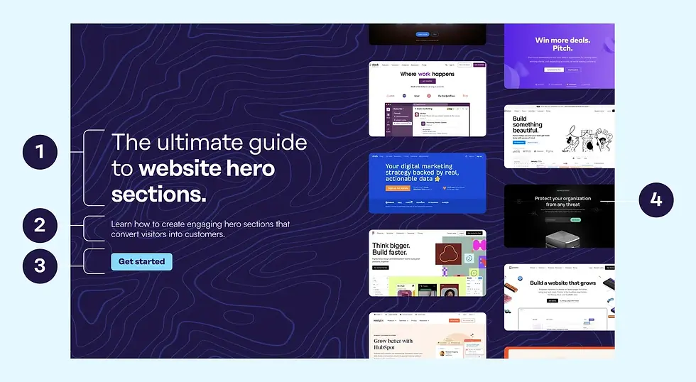
The top section of your landing page should catch attention and motivate people to keep scrolling. This isn’t the place for vague or clever headlines—it should be clear, focused, and backed up by either a visual or a short explanation. If someone only sees this top section, they should still understand the offer.
The hero typically includes:
Headline – Say what you offer clearly and quickly.
Subheadline – Add context or expand on the benefit.
CTA Button – Encourage immediate action.
Visual – Add a product image, illustration, or short looping video to help tell the story.
How to build it in Wix Studio:
Add a 2-column grid to your hero section.
In one cell, add a Text element for your headline. Style it using custom fonts and line height settings.
Add a Button, then link it to an anchor, lightbox, or form. Adjust the hover state to give users visual feedback when they interact with it.
Upload an image or video to the other grid using the Media panel. Adjust its size and position to support the text visually.
5. Stick to One Clear CTA
A landing page should be built around one specific action. If you give users too many choices, you introduce friction and dilute the message. A strong CTA makes it easy for visitors to say “yes” without thinking twice.
Good places to put your CTA:
Top of the page – Visible before scrolling.
Middle of the page – After benefits are explained.
End of the page – Reinforcing the message one last time.
Tips for CTA design in Wix Studio:
Use contrast: Pick a button colour that stands out from the background.
Use short, action-focused text like “Get Started” or “Book My Spot”.
Use motion effects to guide the eye—subtle slide-in or fade-in works well.
Pro Tip: Add hover effects using the State panel to make your CTA feel interactive. A simple colour change or slight scale-up can add tactile feedback that encourages clicks.
6. Use Testimonials and Social Proof
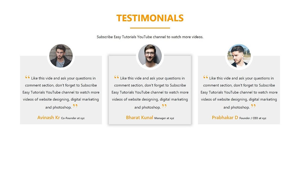
Many visitors hesitate without validation, even if your offer is great. To help remove doubt, include testimonials, customer reviews, and partner logos to show that real people have already taken the leap. It’s one of the most effective ways to build trust.
Keep your social proof simple and honest:
Use real photos, names, or company titles.
Focus on short quotes that mention specific results.
Avoid overly polished or generic reviews. Real ones connect better.
Highlight known brands if you’ve worked with them.
To build this section in Wix Studio:
Use a Repeater if you want to show multiple testimonials in the same format.
Or use a 2–3 column Grid with custom spacing and image alignment.
Drop in a photo, name, and quote for each testimonial.
Style text, star ratings, and client images using custom themes.
Connect your testimonials to a CMS collection if you want to update them dynamically later on.
7. Show Benefits with Visual Clarity
Visitors don’t read every word—they scan. Your benefits should be formatted to match that behaviour. People can get the gist quickly through icons, bold headers, and short phrases without feeling like they’re reading a sales pitch.
Layout example:
Add a 3-column grid to a new section.
Add an Icon at the top of each column. This is a great place to use icons from Wix’s built-in icon library or custom SVGs that match your brand.
Below the icon, include a bold headline and 1–2 short lines of supporting text. Keep things simple and spaced out. Too much text or too many features can make people tune out.
8. Adjust Layouts for Mobile Screens
Know that more than half of your visitors will view your page on a phone, which means your design needs to feel seamless on smaller screens. Mobile users expect quick load times, easy tap targets, and minimal scrolling. With Wix Studio, you can adjust each breakpoint individually, giving you full control while keeping your main layout intact.
Tips for optimising in Wix Studio:
Use the Breakpoint bar at the top to switch views (desktop, tablet, mobile).
Reorder or stack grid columns vertically to avoid squishing text and images.
Resize buttons for tap comfort (minimum 44px height is a good start).
Adjust font sizes using viewport units (vw, em) for responsive text.
Reduce excessive padding so your CTA doesn’t get buried on long scrolls.
9. Connect Your Forms, Automations & Analytics
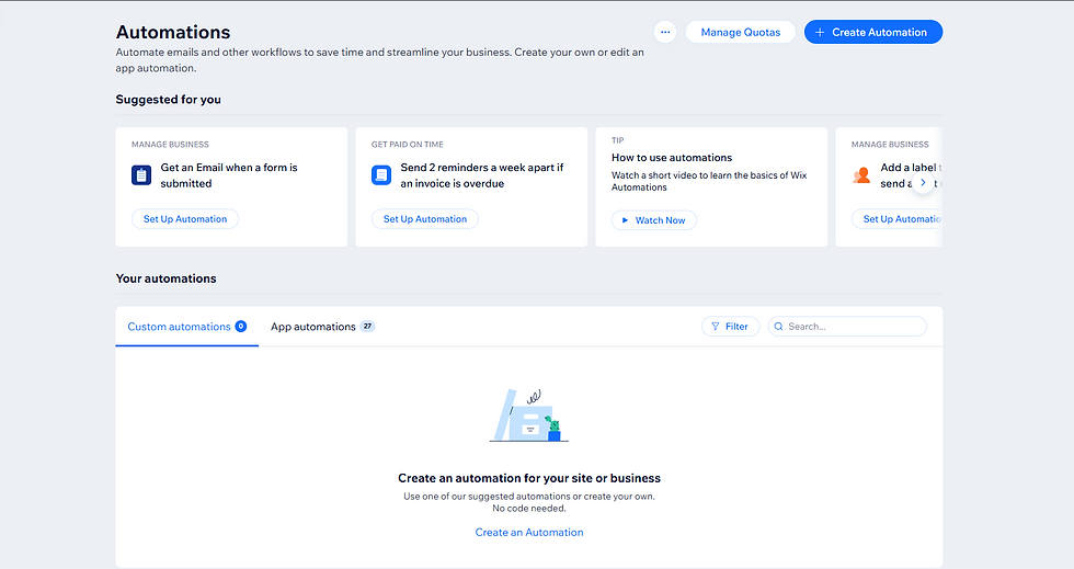
The design phase is nearly complete, but this part is just as important: form submissions that never get filled out or visits that aren’t tracked could mean you’re missing out on valuable data and conversions. Wix Studio makes it easy to plug in automations and analytics from the start.
Here’s what to do:
Add a Form from the Add panel.
Set up form fields and connect them to your CRM or email list.
Open Wix Automations to set up email confirmations or internal alerts.
Insert tracking codes under Settings → Tracking & Analytics (Google Analytics, Meta Pixel, etc.)
Make sure forms work on mobile, too. Tap through, test them, and confirm you’re getting submissions.
10. Final Touches Before You Hit Publish
Your page is up and running! But don’t skip the last few tweaks: SEO metadata, page speed, and small URL tweaks can have a big impact on visibility and user experience.
Final checklist:
Add an SEO title and description under Page Settings.
Set a clean, readable URL (like /special-offer or /free-trial).
Compress images and use WebP format if possible.
Double-check layout and responsiveness across breakpoints.
Once everything’s in place, hit Publish, and don’t forget to test the live link on desktop and mobile to confirm everything loads quickly and works smoothly.
Wrapping It Up
Designing a high-converting landing page in Wix Studio is all about purposeful strategy, where every section serves a clear purpose. When your layout, copy, and call-to-action all work together, you end up with a page that drives real results.
Once you’ve built one good landing page, the next one gets easier! You can use your work as a template, test and improve as you go, and always prioritise clarity.
If you’re new to Wix Studio or looking for personalised guidance on your landing pages, don’t hesitate to reach out. We’re here to support your journey toward creating pages that truly deliver.


