.png)
.png)
Mastering Responsive Design in Wix Studio: Desktop, Tablet & Mobile Tweaks
- Volt Agency

- Aug 19, 2025
- 5 min read
People browse websites on every imaginable screen: desktops, tablets, smartphones—you name it! And here’s the thing: your site’s first impression can make or break a visitor’s experience. Responsive web design is all about ensuring your website looks and works beautifully on any device. Luckily, Wix Studio’s Breakpoint Editor makes it easier than starting from scratch for each screen size.
In this guide, we’ll explore how to make the most of breakpoints, what tweaks work best for each device type, and some insider tips to make your site look polished everywhere.
Why You Shouldn’t Just “Shrink” Your Desktop Design
A common rookie mistake? Designing for the desktop first and then hoping the mobile version will magically look okay. Spoiler alert: it rarely does. Elements overlap, text becomes tiny and unreadable, and buttons can become impossible to tap.
Mobile and tablet users behave differently. They scroll, tap, and swipe instead of hovering with a mouse. Responsive web design adapts layouts to the user’s device and browsing behaviour. So, what should you rethink?
Legibility – Is the text easy to read without zooming?
Button size – Are touch targets big enough to tap easily?
Content order – Does the flow still make sense when content stacks vertically?
Loading time – Are there heavy elements that slow things down unnecessarily?
Wix Studio’s Breakpoint Editor allows you to make these adjustments for each screen size individually, giving you full control over how your site looks and functions on desktops, tablets, and mobiles. Let’s see how.
How Breakpoints Work in Wix Studio
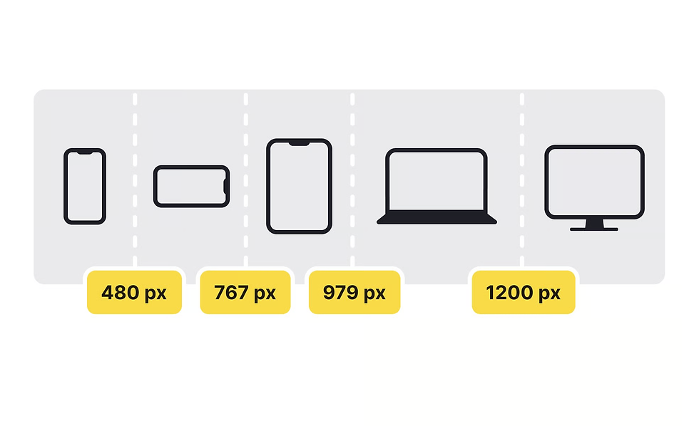
A breakpoint is basically a screen width where your site layout can shift to look better. Wix Studio gives you three default breakpoints:
Desktop: Usually for widths above 1000px. Large canvas, lots of room.
Tablet: Mid-size screens, roughly 768px–1000px. Kind of tricky space.
Mobile: Narrow screens under 768px. Where most web traffic hangs out.
The beauty of the Breakpoint Editor? Each breakpoint is its own workspace. You can move elements around, resize text, hide or show sections—all without affecting other views.
Getting into the Breakpoint Editor
Ready to start refining your layouts? Follow these steps to access the Breakpoint Editor:
Open your site in Wix Studio Editor.
At the top of the workspace, click the Desktop, Tablet, or Mobile icon to switch views.
Edit each breakpoint individually, adjusting element size, spacing, and placement.
Some structural changes (like adding a new section) will carry over to all breakpoints. Design tweaks, however, stay specific to the device you’re working on.
1. Desktop Layouts
Big screens are like a playground—you have room to spread out content, show high-res images, and organise navigation without chaos. A few tips:
Give elements space – Large screens can handle more whitespace, which improves clarity.
Use high-resolution imagery – This is where you can display wide hero images and background videos without immediate concern for load speed.
Organise navigation clearly – Desktop menus can accommodate multiple links laid out horizontally.
Keep grids manageable – Complex multi-column layouts may look great here, but will need rethinking for smaller screens.
2. Tablet Layouts
Tablets are the awkward middle ground—not as wide as desktops, but bigger than phones. Without fine-tuning this layout, you risk a design that looks either squashed or overly stretched. Optimising for tablets means striking the right balance so content feels spacious, easy to read, and comfortable to interact with on a touch screen. Here’s how to adjust your tablet layouts:
Scale down images so they don’t dominate the screen.
Drop the multi-column layouts—reduce the number of columns for better readability.
Users still interact with fingers, so maintain touch-friendly spacing.
Shorten text length (keeping lines between 50–75 characters) to keep reading comfortable.
3. Mobile Layouts
Most visitors are on phones, and getting this version right can make or break engagement. These are the things to keep in mind:
Prioritise top content – Place the most important information or calls to action first.
Simplify navigation – Replace wide menus with a compact hamburger icon or sticky bottom menu.
Optimise imagery – Use smaller file sizes to improve loading times.
Stack vertically – Keep everything in a logical, single-column flow.
Maintain legible fonts – Use body text of at least 16px for easy reading.
Using the “Hide on Device” Feature
Sometimes an element works great on desktop but is a nightmare on mobile. Wix Studio’s Hide on Device lets you remove it from specific views without deleting it.
To hide it:
Select the element.
Open the More Actions menu (three dots).
Choose Hide on Device.
The Hide on Device feature works well for:
Large decorative images that slow mobile load times
Complex animations that don’t perform smoothly on smaller screens
Desktop-only calls to action that need a more compact alternative for mobile
Balancing Design with Speed
A site that works well on any screen also needs to load without keeping visitors waiting. Slow pages can frustrate visitors and hurt your Wix site’s SEO rankings, so balancing visuals with performance is vital. Here are a few ways to keep your site fast without sacrificing quality:
Compress images using Wix tools.
Swap large visuals for lighter alternatives on mobile.
Limit unnecessary animations and background videos.
Use lazy loading for images below the fold.
Testing Responsiveness Outside the Editor
Preview mode is handy, but nothing beats real-world testing:
Resize your browser window to watch how layouts adapt.
Check on actual devices—desktop, tablet, phones.
Try portrait and landscape.
Tap every button—yes, even that tiny one in the corner.
Adding Custom Breakpoints in Wix Studio
Default breakpoints in Wix Studio are great for common devices. But some visitors use less typical screens, like large tablets in landscape mode, ultrawide monitors, or smaller laptops. In these cases, you can add a custom breakpoint to adjust your site’s layout and make sure it looks great at that exact width.
Custom breakpoints let you:
Perfect layouts for odd dimensions.
Avoid weird text wrapping or image stretching.
Optimise for specific audiences—conference kiosks, retail POS, gaming rigs.
Keep designs consistent for unique viewing habits.
How to Add a Custom Breakpoint in Wix Studio
Open the Breakpoint Menu.
Click “Add Breakpoint.”
Set Target Width (exact pixel or range). You can use:
Exact values (e.g., 1366px) for specific devices.
Ranges, to account for slight variations in screen size.
You can also target widths based on analytics data to match your visitors’ most common screen sizes.
Name Your Breakpoint (Optional) - Give it a descriptive name like “Large Tablet Landscape” or “Small Laptop” for easy reference.
Design for Your New Breakpoint - Once added, switch to your custom breakpoint view and adjust:
Layout positioning
Font sizes
Image scaling
Spacing and padding
These changes apply only to this breakpoint and narrower ones—wider breakpoints won’t be affected.
Best Practices for Custom Breakpoints
Start with the widest view, then work down to smaller ones.
Test on real devices whenever possible, not just in the editor’s preview.
Keep breakpoints to a minimum—too many can overcomplicate web design maintenance.
Document your breakpoints so team members know why they exist.
Final Thoughts
A well-designed responsive Wix website says you’ve thought about your audience’s needs—whether they’re browsing on a 27-inch monitor or a smartphone in their hand. By taking time to review each breakpoint, hiding elements where needed, and testing on multiple devices, you can create a site that keeps your visitors engaged and confident as they explore your content.
Need help with your transition to responsive web design? Contact us today, and we’ll help you make your site easy to use, great to look at, and fully optimised for every device.


